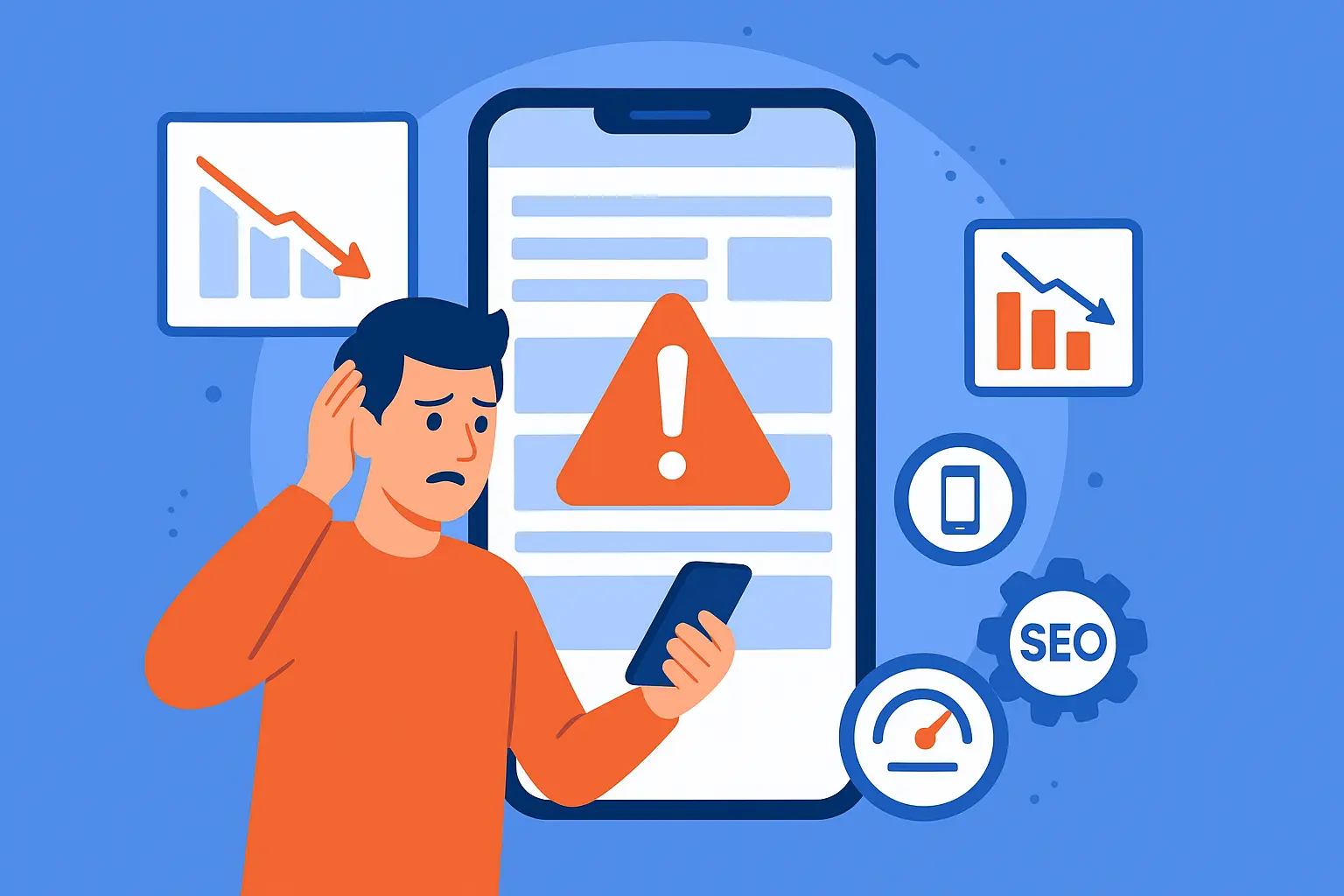
In today’s fast-paced digital world, your website is more than just an online brochure—it’s the backbone of your business. But here’s a truth many small business owners overlook: if your website isn’t mobile-friendly, you’re losing customers, traffic, and revenue—often without even realizing it.
With over 60% of web traffic coming from mobile devices, Google has made mobile usability a core factor in its ranking algorithm. That means if your website struggles on smartphones or tablets, it’s essentially invisible to a massive portion of your audience.
In this guide, we’ll explore why mobile-friendly websites rank higher, how to test your site’s mobile readiness, and what steps you can take to ensure your visitors have a smooth, engaging experience.
1. The Mobile-First Era
Google officially rolled out mobile-first indexing in 2018, which means the search engine primarily uses the mobile version of your website for ranking and indexing.
Think about it: most users now browse on smartphones. If your site is hard to navigate, slow, or improperly formatted, visitors leave—and Google notices. This affects your rankings, organic traffic, and ultimately, your sales.
Key takeaway: Mobile-friendly websites aren’t optional anymore—they’re a necessity.
2. How Mobile-Friendliness Impacts SEO
A mobile-friendly website affects SEO in multiple ways:
a) Improved User Experience (UX)
When your site adapts to different screen sizes, users can read content without zooming, click buttons easily, and navigate effortlessly. This reduces bounce rates and increases engagement—two factors Google rewards.
b) Faster Loading Speed
Mobile users expect fast-loading websites. Slow websites frustrate visitors, leading to higher bounce rates. Google uses page speed as a ranking signal, so optimizing for mobile speed is critical.
c) Lower Bounce Rate
Imagine visiting a website on your phone and having to pinch, zoom, and scroll endlessly just to read the content. Frustrating, right? Users leave, and Google interprets this as poor relevance. Mobile-friendly websites keep visitors engaged, signaling to search engines that your content is valuable.
d) Better Local SEO
Many mobile searches are location-based, like “best cafe near me” or “handloom stores in Bankura.” Mobile-friendly websites with fast loading times and easy navigation improve local search rankings and help small businesses capture nearby customers.
3. Key Features of a Mobile-Friendly Website
Not all mobile-friendly websites are equal. Here’s what to focus on:
- Responsive Design: Your website should adapt seamlessly to any screen size—desktop, tablet, or smartphone.
- Readable Fonts: Text should be legible without zooming. Avoid tiny fonts.
- Clickable Buttons & Links: Ensure buttons are large enough for users to tap comfortably.
- Fast Loading Times: Compress images, leverage browser caching, and use lightweight code.
- Minimal Pop-Ups: Avoid intrusive interstitials that block content on mobile screens.
- Optimized Images & Media: Use mobile-optimized images to reduce loading time.
Pro tip: Even small businesses in areas like Bankura District can hugely benefit by implementing these features to attract local customers searching via mobile devices.
4. How to Test Your Website’s Mobile-Friendliness
Before you start guessing, test your website to see where it stands. Here are effective tools and methods:
a) Google Mobile-Friendly Test
Google offers a free tool to check mobile usability. Simply enter your website URL, and you’ll get a detailed report highlighting issues.
b) PageSpeed Insights
Google’s PageSpeed Insights measures your website’s speed on mobile and desktop. It also provides actionable recommendations for improvement.
c) Browser Emulators & Responsive Checkers
Use tools like BrowserStack or your browser’s developer tools to simulate your website on different mobile devices.
d) Real Device Testing
Nothing beats checking your website on actual devices. Test on smartphones, tablets, and various screen sizes to get a true sense of user experience.
5. Common Mobile Issues & Fixes
Here are the most common mobile issues small businesses face and how to fix them:
| Issue | Impact | Fix |
|---|---|---|
| Slow page speed | High bounce rate | Compress images, enable caching, reduce heavy scripts |
| Tiny text | Poor readability | Increase font size, use responsive typography |
| Buttons too close together | Navigation frustration | Increase spacing and button size |
| Pop-ups blocking content | Bad UX | Limit pop-ups, make them easy to close |
| Horizontal scrolling | User confusion | Use responsive design to fit content to screen |
If your website audit reveals any mobile issues, it’s not just a technical problem—it’s a business opportunity. A professional digital marketing agency can help fix these issues quickly, improving your Google rankings and boosting conversions.
6. Mobile SEO Best Practices
To ensure your website performs well on mobile, follow these proven best practices:
- Responsive Web Design: Avoid separate mobile sites; instead, use one site that adapts dynamically.
- Optimize Images: Compress images without losing quality. Use modern formats like WebP.
- Prioritize Above-the-Fold Content: Important content should load first for faster engagement.
- Minimize Redirects: Too many redirects slow down mobile loading speed.
- Leverage Accelerated Mobile Pages (AMP): AMP ensures lightning-fast load times for blog posts and landing pages.
- Improve Navigation: Use sticky menus or hamburger menus to simplify mobile navigation.
- Monitor Analytics: Track mobile traffic, bounce rates, and engagement in Google Analytics to identify weak points.
7. Real-World Example: Local Business in Bankura
Let’s consider a handloom shop in Bankura with an outdated, non-responsive website. Despite having high-quality products, the website struggled to attract local customers.
After implementing a mobile-friendly redesign:
- Page loading time decreased from 8 seconds to 2.5 seconds
- Bounce rate dropped by 40%
- Local search traffic increased by 70%
The result? Higher Google rankings, more footfall in the store, and increased revenue—all because the website worked seamlessly on mobile devices.
8. DIY vs. Professional Help
While you can attempt mobile optimization on your own using tools like Google’s Mobile-Friendly Test or PageSpeed Insights, sometimes professional help is worth the investment. A digital marketing agency can:
- Audit your website for mobile issues
- Implement responsive design and speed optimization
- Enhance user experience for mobile visitors
- Align mobile SEO with your business goals
This creates a long-term competitive advantage—especially in regions like Bankura District, where small businesses are catching up with digital trends.
9. Natural Upsell: How an Audit Can Help
Here’s the reality: if your audit shows mobile issues, your website is likely losing customers right now. Fixing these issues isn’t just a technical tweak—it’s a revenue booster.
At SouravLabs, we specialize in mobile optimization and SEO for small businesses. We help local businesses like yours:
- Identify mobile usability issues
- Improve website speed and responsiveness
- Boost Google rankings for local searches
- Increase conversions and sales
Think of it this way: a mobile-friendly website doesn’t just rank higher—it sells more.
10. Key Takeaways
- Mobile-first indexing means Google looks at your mobile website for rankings.
- A mobile-friendly website improves UX, reduces bounce rates, boosts SEO, and enhances local search visibility.
- Test your website using Google Mobile-Friendly Test, PageSpeed Insights, and real device checks.
- Common issues include slow loading speed, small fonts, close buttons, and pop-ups.
- Following mobile SEO best practices ensures your site ranks higher and converts visitors into customers.
- If your audit shows mobile issues, consider professional help—it’s an investment in growth.
Call to Action (CTA)
Don’t let a non-mobile-friendly website hold your business back. Get a professional mobile audit from SouravLabs today and watch your Google rankings, traffic, and sales soar.
📧 Contact us at contact@souravlabs.com
🌐 Visit: www.souravlabs.com